Jaguar, sheer genius or complete stupidity?
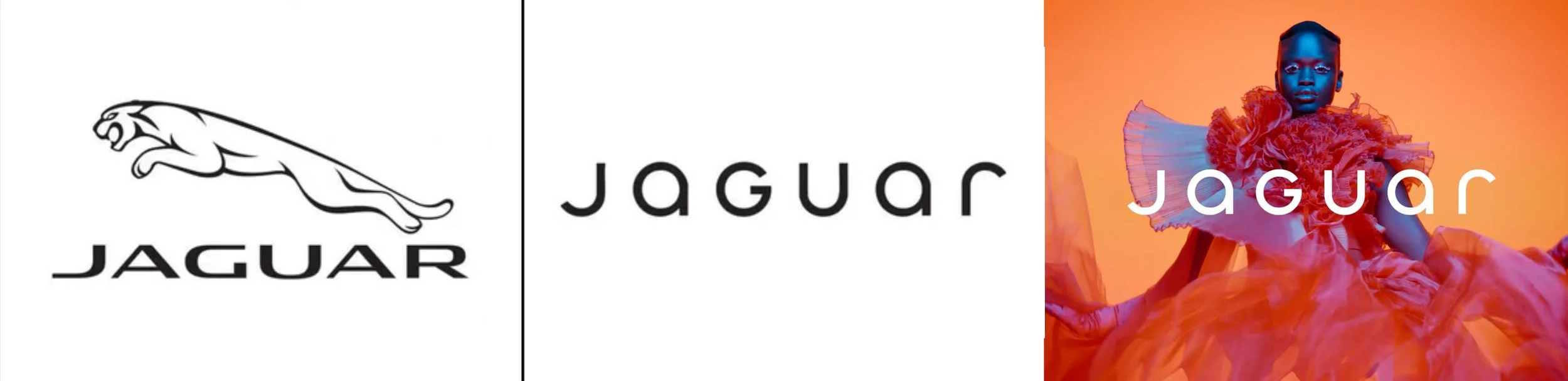
Jaguar (before and after) rebrand
In an era of guarded consumers and fleeting whispers, Jaguar has roared back into the conversation with boldness and intrigue. Their audacious decision to replace the iconic “growler” emblem with a strikingly modern design hasn’t just sparked debate—it’s ignited a wildfire of attention.
For decades, Jaguar has been synonymous with success, catering predominantly to affluent, white professionals through its timeless luxury branding. But now, the brand is swerving dramatically away from its heritage, seemingly abandoning its loyal enthusiasts in pursuit of a younger, more diverse audience. The new look, however, feels oddly disconnected—reminiscent of a logo you might find outside a Midwestern mall jewelry store where teenagers get their ears pierced.
This rebranding effort raises an important question: is this a bold reinvention or a calculated publicity stunt? The jury is still out. What’s certain is that Jaguar is turning heads and capturing attention, perhaps for the first time in years. Whether this reinvention will be remembered as genius or a misstep remains to be seen. For now, Jaguar has succeeded in becoming the talk of the town—and in the crowded world of brand communication, sometimes that’s half the battle.
As an exercise, I explored how the iconic “growler” Jaguar cat might evolve rather than disappear, experimenting with graphic elements like movement, wind, or beams of light to bring a modern feel to the emblem without losing its essence. I also tested updates to the logotype to align with the sleek aesthetic of today’s automotive industry. While these concepts are just starting points and need refinement, they represent an attempt to bridge heritage and modernity—a path Jaguar could have pursued.
I’m curious to see how this bold shift plays out for the brand. Are we witnessing a new chapter of ingenuity, or is this all an elaborate stunt? Either way, Jaguar has our attention, and that, at least, is a win.
